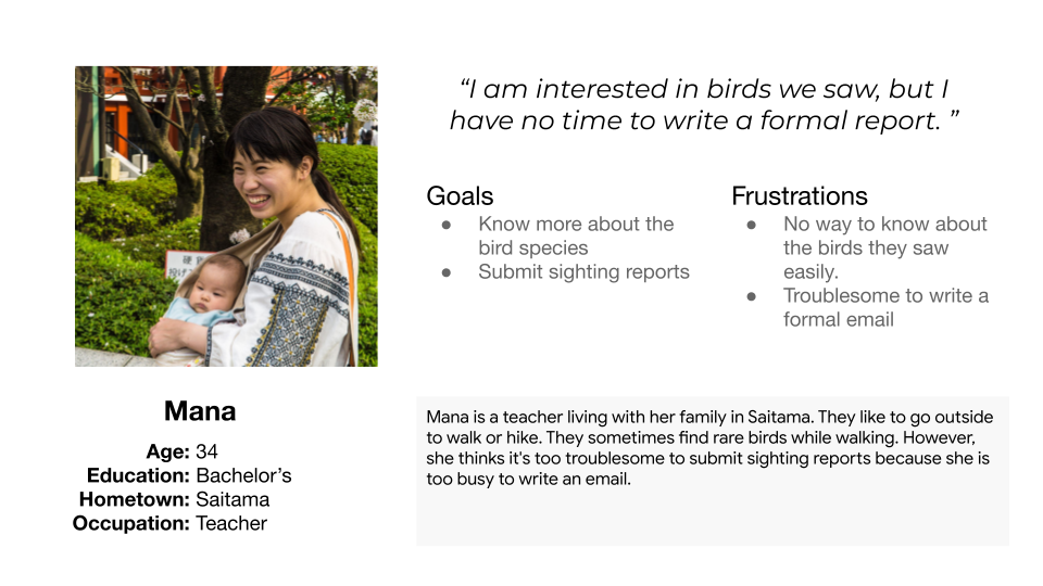
The sighting report form used in my hometown is troublesome to submit and not attractive to the residents without knowledge about birds.
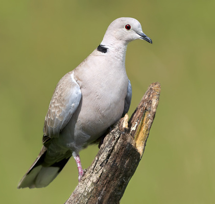
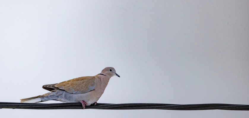
Saitama prefecture is the primary habitat of Eurasian collared doves in Japan. The number of individuals decreases, and the habitat is shrinking. Since the preservation plan is decided depending on the habitat data, the sighting report is essential. The prefecture asks people to submit a sighting report via mail or call.
However, the current user flow of submitting reports requires an effort because reporters need to fill out a Word file and send it an email. Also, this flow does not give them the sense of contributing to the community so it is not attractive to users without the specific passion for birds.
As a result of a survey with 8 people found online about how they think of this process, half were negative about submitting reports, and three answered that the reporting process is too troublesome.
How might we make the bird sighting reporting process seamless, enjoyable, and informative for people in a local community?
I did a quick ideation exercise to consider ways to collect sighting reports easily.
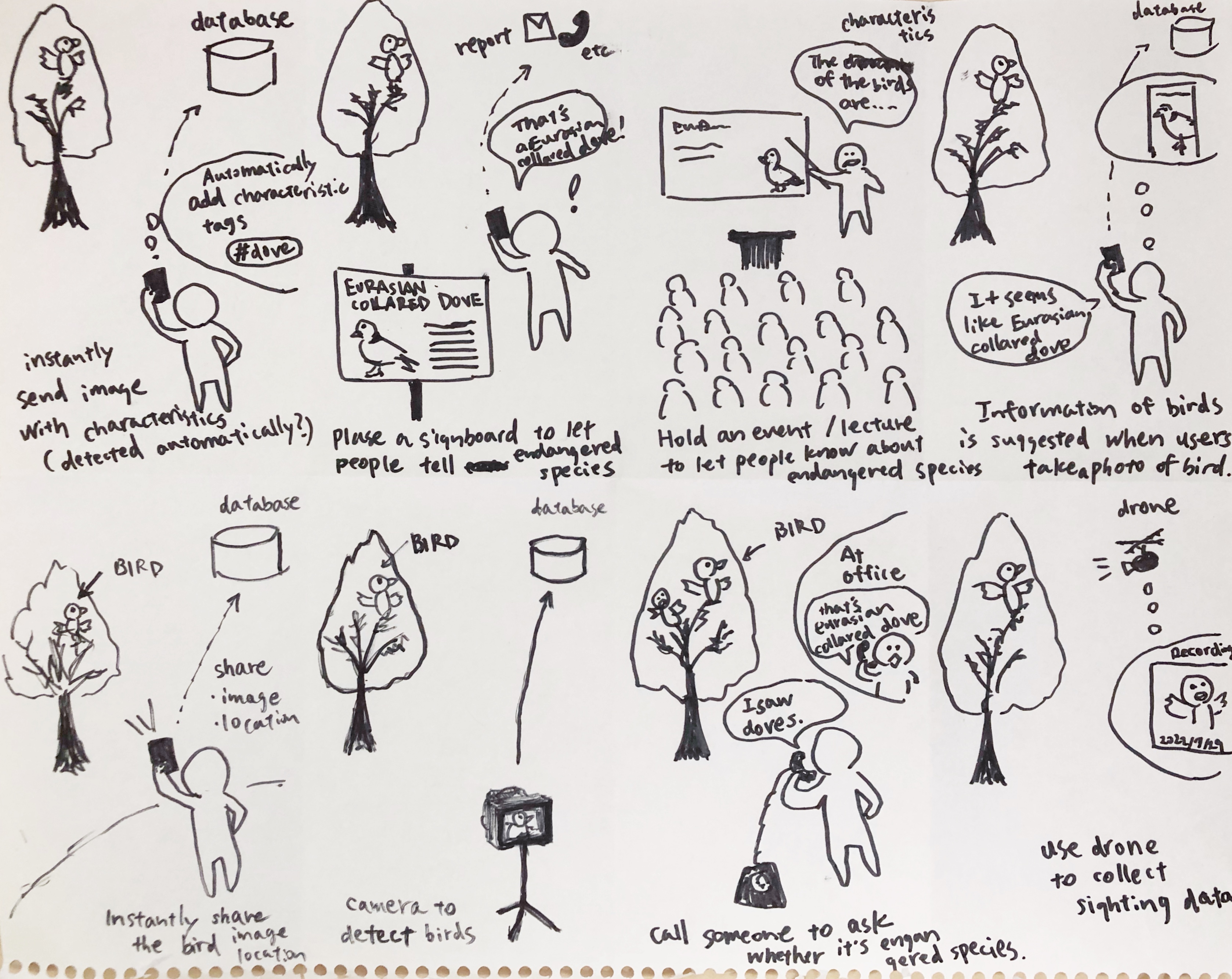
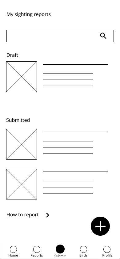
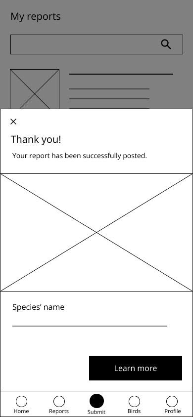
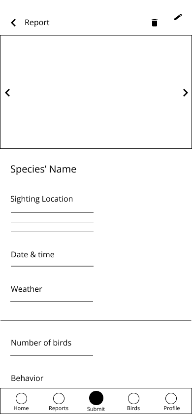
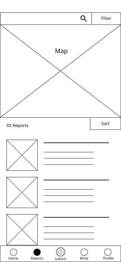
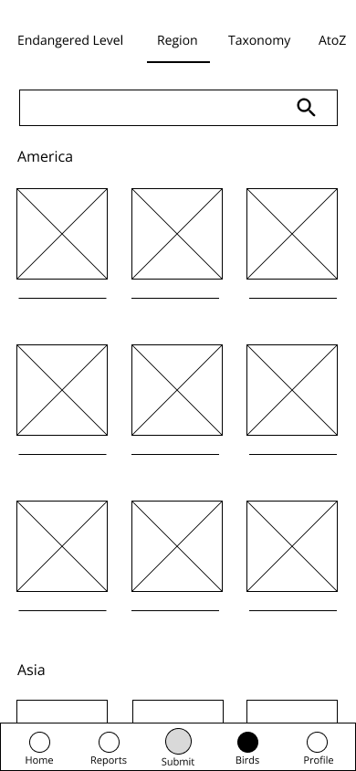
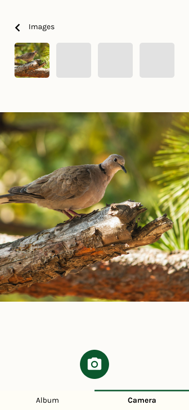
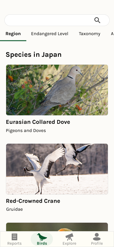
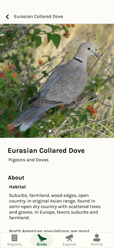
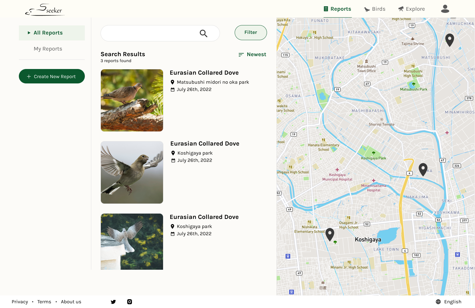
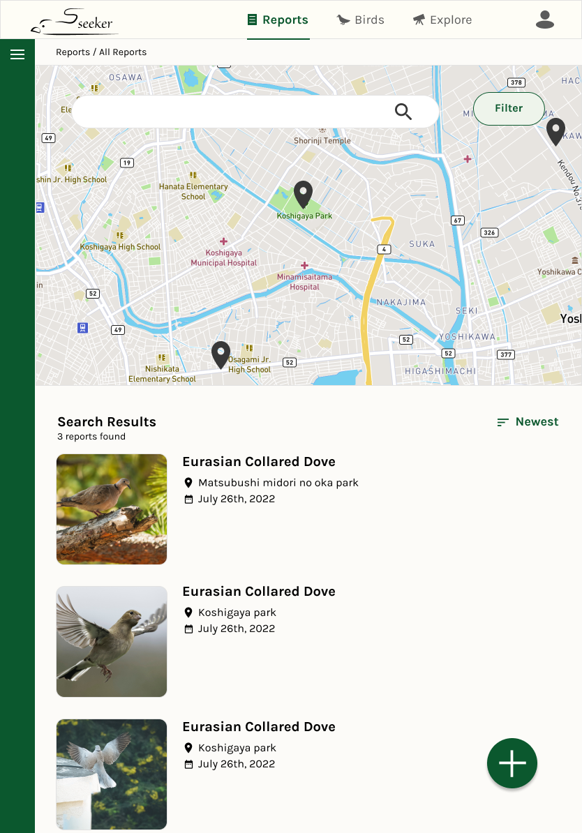
Bird database where users can post sighting reports using their phones and browse other people's posts and bird knowledge.
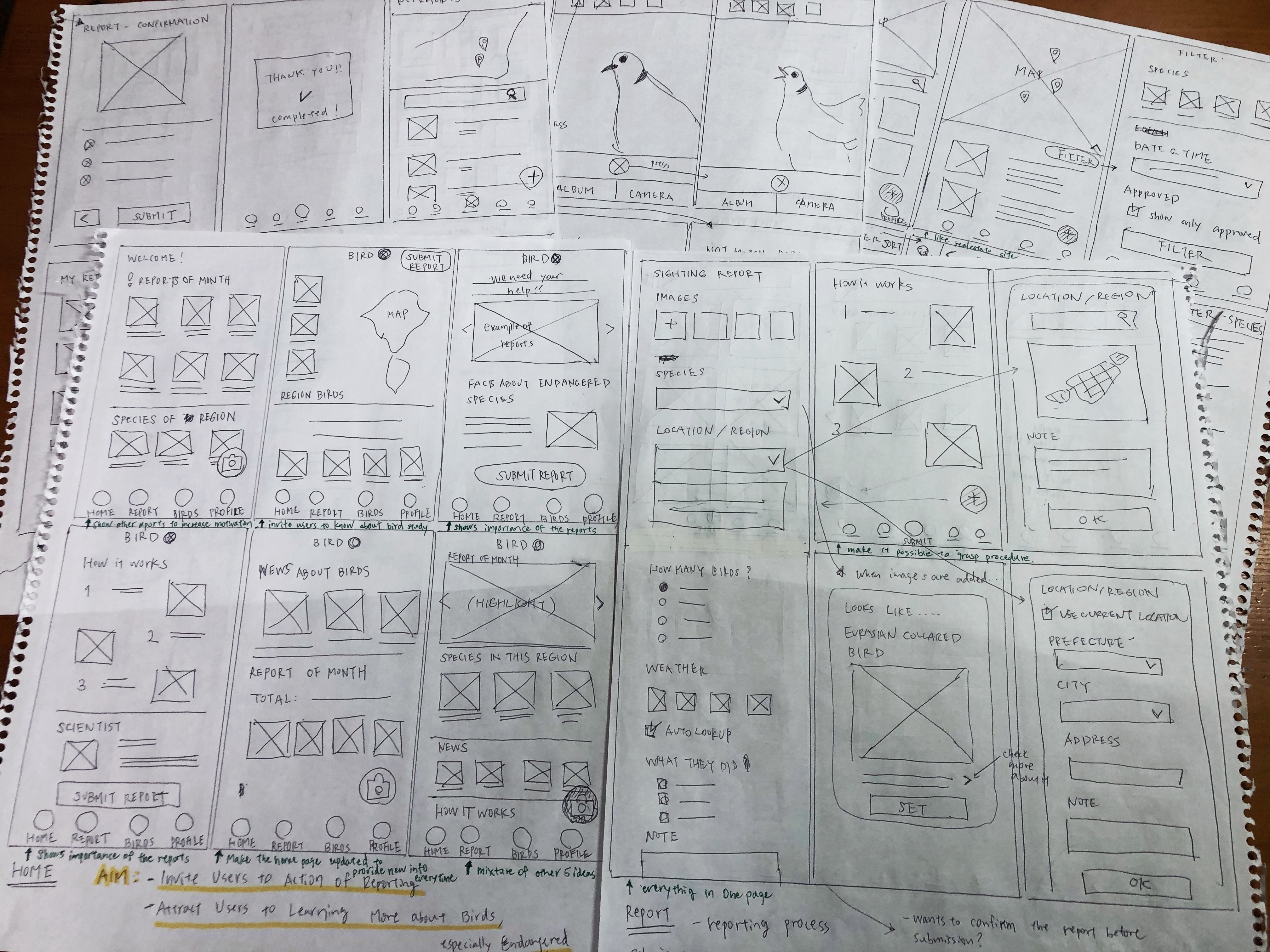
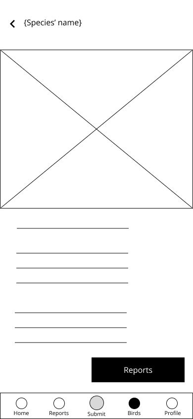
I started from paper wireframes and then shifted to Figma wireframes.
We conducted a usability study to evaluate usability of my prototype.
As a result, I got feedbacks including the following.
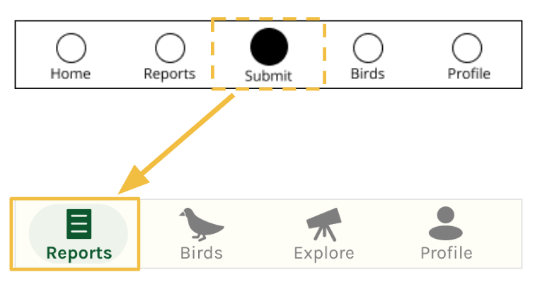
The navigation information should be clearer so the users can know where they are. In the mockup, the menu where users are currently is highlighted with a darker icon, and the bolder font is applied to guide users.
The site structure should be simpler. A participant also pointed out that the "submit" menu is confusing because of the word choice. Reflecting on this finding, the “submit” menu was removed, and instead, the call to action button to create a new report was located on the “report” menu.
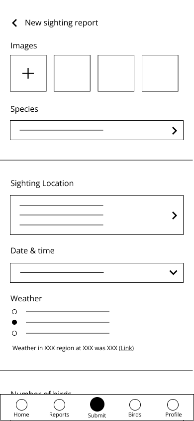
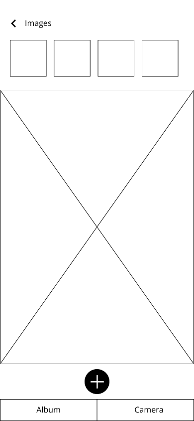
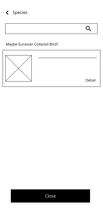
After usability testing, I created high-fidelity prototypes.
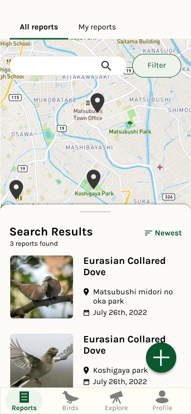
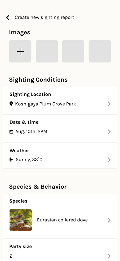
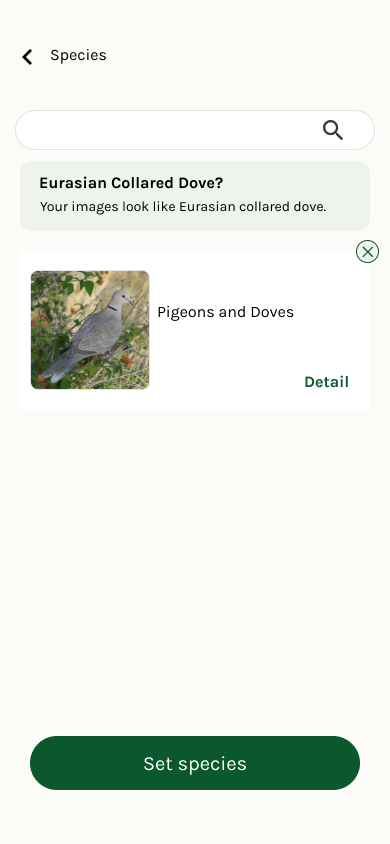
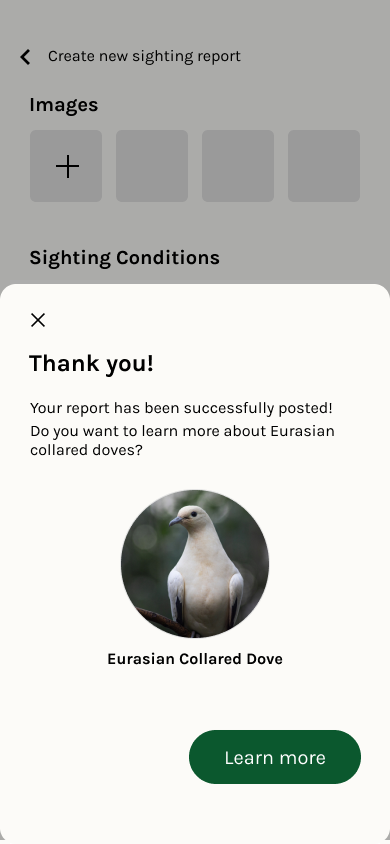
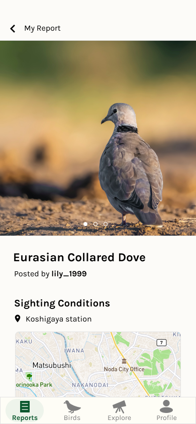
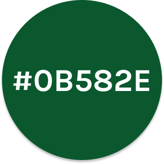
The visual design elements aimed to communicate a natural feel. The combination of primary color, dark green and background color passes WCAG AAA.
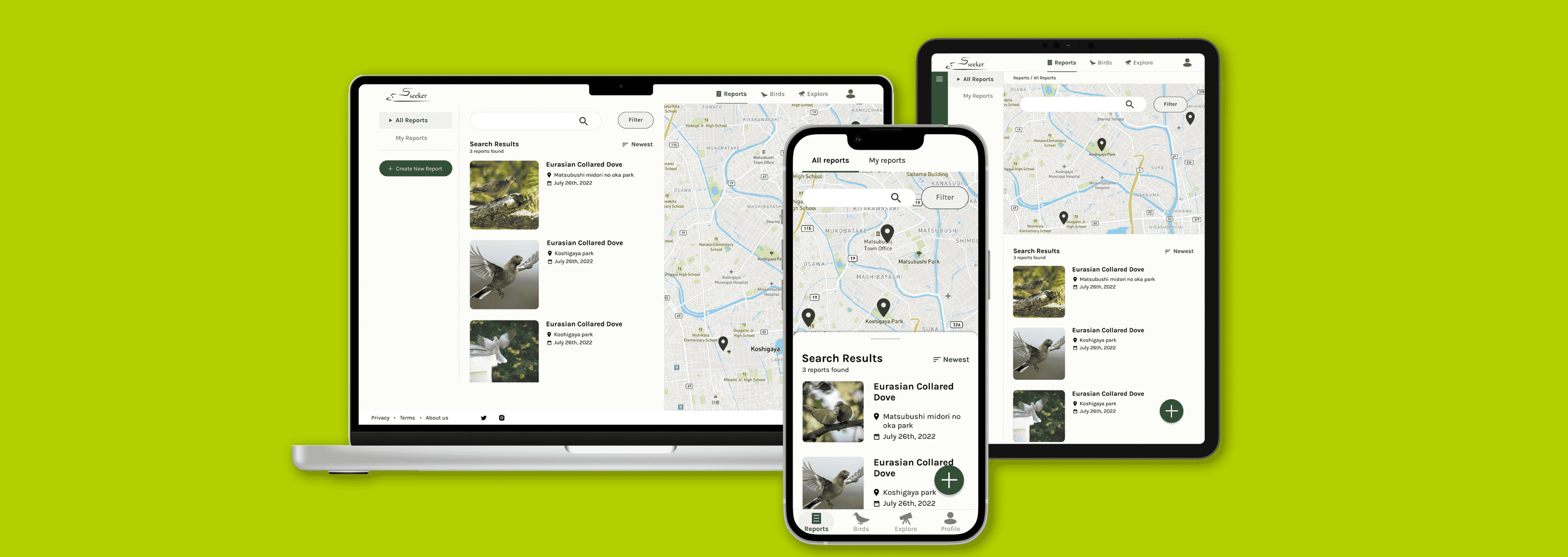
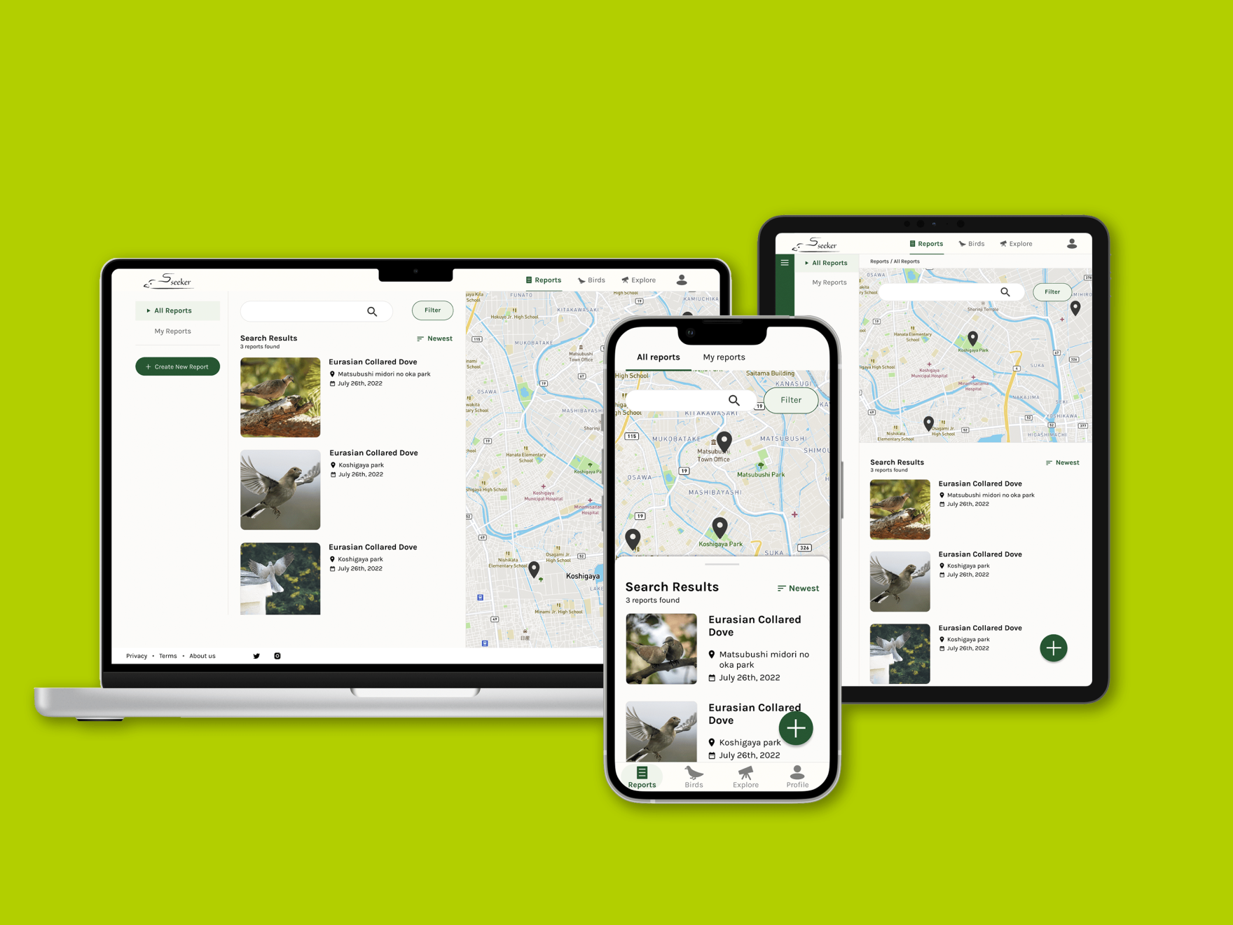
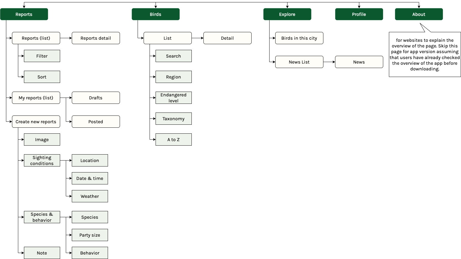
After designing the mobile app, I worked on a responsive website. To ensure consistency between the mobile app and website, I created the sitemap and sorted out the information structure.
I designed mobile app, desktop, and tablet screens.
In the unmoderated study, some feedback comments were too short or required further questions to clarify. Next time, I want to collect more qualitative data through a moderated study. Also, I would like to design features for researchers to analyze the sighting reports submitted by residents.


