Redesigning a Nigerian solar company's website

How I collaborated within regional and resource constraints, resulting in strong client satisfaction and buy-in

Overview
Ceneco Green Power, a Nigerian solar energy company, recently rebranded as an innovation leader in African solar power. However, its website was not aligned with the new brand. It also lacked essential content and a clear information architecture, which weakened credibility and caused confusion about the company’s services. Overcoming regional barriers, context gaps, and limited client resources, we redesigned 11 desktop and 11 mobile pages, delivering Figma mockups and a design guide to support implementation.
Responsive Design
Competitive Analysis
Information Architecture
Design Systems
Design Documentation
Project Type
UX consulting for Ceneco Green Power (In-class project for external client)
Timeline
Sep 2024 - Dec 2024
Team
4 graduate students in UX design, including myself
My Role
Our team contributed equally to the research. During the design phase, I was responsible for the service’s main page, 5 service detail pages, and the design guide documentation.
Impact
Our collaborative approach led to client satisfaction and buy-in. The client incorporated parts of our work into their website and received positive feedback from customers.
Our Client & Goal

Redesigned the website for a Nigerian solar company transitioning into a tech-driven leader

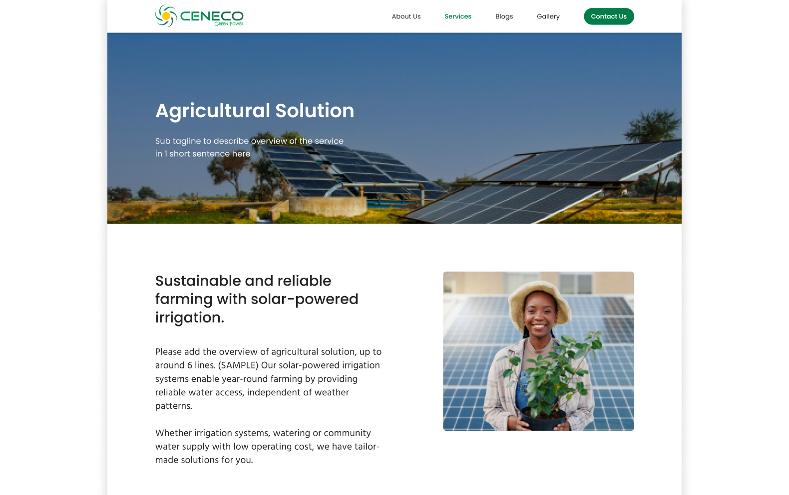
Ceneco Green Power, a Nigerian solar company, specializes in solar system installation and maintenance for residential, commercial, agricultural, off-grid use, and EVs. The company is rebranding as an African solar tech leader, leveraging AI and IoT. Our mission as UX consultants was to redesign the website.

Our Mission

Redesigned the website to reflect new brand and enhance UX

Our mission as UX consultants was to redesign the website and enhance the overall user experience, with a focus on the following areas.

Presenting Service
Navigation & IA
Clear & Easy CTA
Responsive Design
Brand Communication
Problems

While the business thrives on word of mouth, the website wasn't performing as well

Site analytics revealed low traffic (50 users/month) and a high bounce rate (68%), indicating poor customer acquisition through the website. We identified 3 underlying issues that needed to be addressed.

Old Website
Problem 1
Unclear Offerings
Confusing IA and lack of information make it difficult to understand the services.
Problem 2
Lack of Credibility
Limited content and inconsistent design and images raised concerns about credibility.
Problem 3
Brand Misalignment
The old website did not reflect the company’s new identity as a tech leader.
Solution - Final Design
Challenges

We had regional and resource constraints

Challenge 1
No access to Nigerian users
Regional barriers prevented access to Nigerian customers
Challenge 2
Different energy access conditions
We needed to consider Nigeria’s local energy access context to reach users effectively.
Challenge 3
Limited client implementation capacity
The small team managed the site. A simple, scalable design were key to long-term impact.
Research

Balancing alignment with industry standards and originality is key for solar websites

With no direct access to Nigerian customers, we adjusted our research approach. In place of user interviews, we analyzed the websites of 9 solar companies across Nigeria, US, and Europe, and interviewed the client’s CEO and COO to understand the industry, their business, customers, and the Nigerian context.

Our competitive research showed that most competitor websites looked similar, highlighting both a common direction to follow and the importance of differentiation. Interviews showed that the company values transparency and strives to communicate its strengths to customers with limited knowledge of solar energy.

Using data to build credibility
Competitors show diverse data such as metrics, reviews, and partnerships to build credibility.
Sharing a similar visual design each other
Competitors share similar visual styles. Balancing industry norms with distinctiveness is essential.
Storytelling across the user journey
Competitors craft narratives that empathize with users at every stage, from entry to contact
Solar as reliable and affordable energy
In Nigeria, where grid electricity is often unreliable, inaccessible, and expensive, solar is valued.
Client strengths: quality, innovation, transparency
The client actively explains the value of solar, their product, and pricing to customers.
Cost is the customer's main concern
Pricing remains a concern, and the client frequently receives questions about it.
Design Strategies

Derived 4 strategies to guide our design

Synthesizing our research, we derived the following strategies.

Showcase technology
Showcase the client’s strengths in technology and innovation, such as AI solar system monitoring.
Highlight success
Leverage data to highlight impact and reinforce credibility.
Educate customers
Foster customer understanding of solar energy to more effectively communicate the company's value.
Guide users through storytelling
Addresses users’ needs and emotions, and resolves concerns at each stage of the journey from the landing to reaching out.
Information Architecture

Held a workshop to incorporate the client's needs and align on website content volume

We conducted a workshop with the client to consider what information to include on each page using a typical competitor sitemap as a reference. After this, we made the sitemap using the result (View Sitemap).

Workshop Objective 1
Foster satisfaction for future buy-in
Align the design with client preferences to minimize gaps between expectations and the final outcome.
Workshop Objective 2
Set expectation for content volume
We aimed to define a feasible scope for the client and ensure they were ready for implementation.
Workshop Objectives
Foster client satisfaction for future buy-in: Achieve buy-in later by considering the client’s preferences, helping reduce the gap between expectations and the final design.
Set expectation for content volume: As the client is responsible for implementation and content creation, we aimed to define a feasible scope and ensure they were prepared.
We conducted card sorting using a typical competitor sitemap derived from our research.
Final Design

Before we get into the iteration process, take a look at the final design

I mainly focused on the service pages, but feel free to explore all the pages using the tabs!

Home page
The homepage showcases Ceneco Green Power’s focus on technology and innovation while introducing its services to lead users to the service page.
Service main page
The service main page highlights Ceneco Green Power’s services and focus on tech integration easily.
Service detail page
The service detail page explains the service in detail and why the audience should go solar and choose Ceneco Green Power.
About us page
The About page is designed to showcase the company's history and accomplishments to build credibility.
Articles page
By promoting a deeper understanding of solar energy, the article pages help users recognize the value of Ceneco Green Power’s offerings.
Final Design

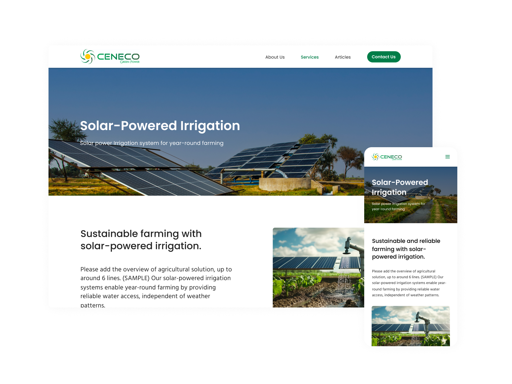
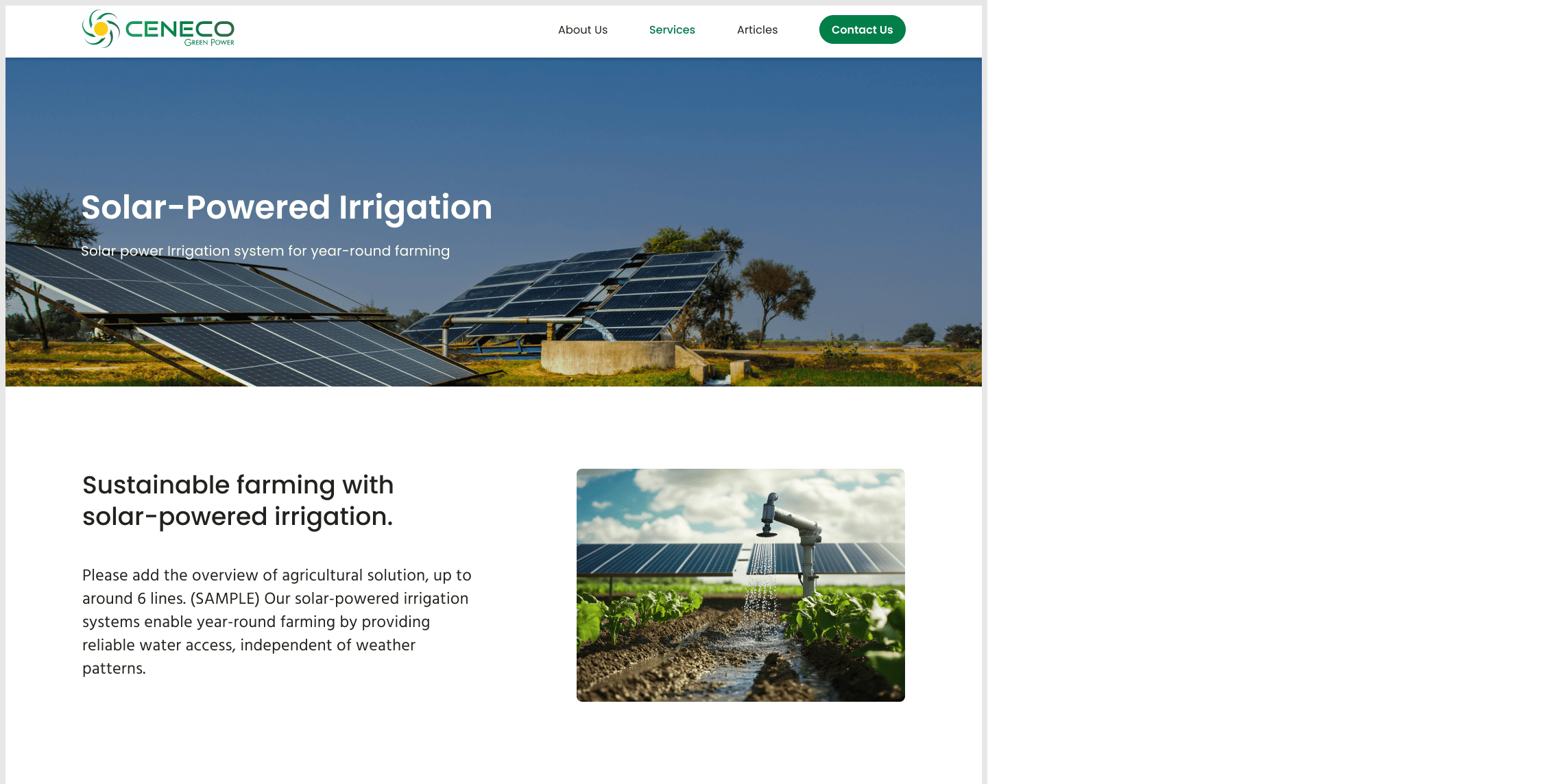
We designed pages for both desktop and mobile

Iteration - How I reached to final design

Making the website more unique and appealing

After creating the version 1 prototype, we gathered feedback from 4 users and refined the design. Below are some of the key improvements.

Improvement 1
Added gradient colors to convey a technological feel

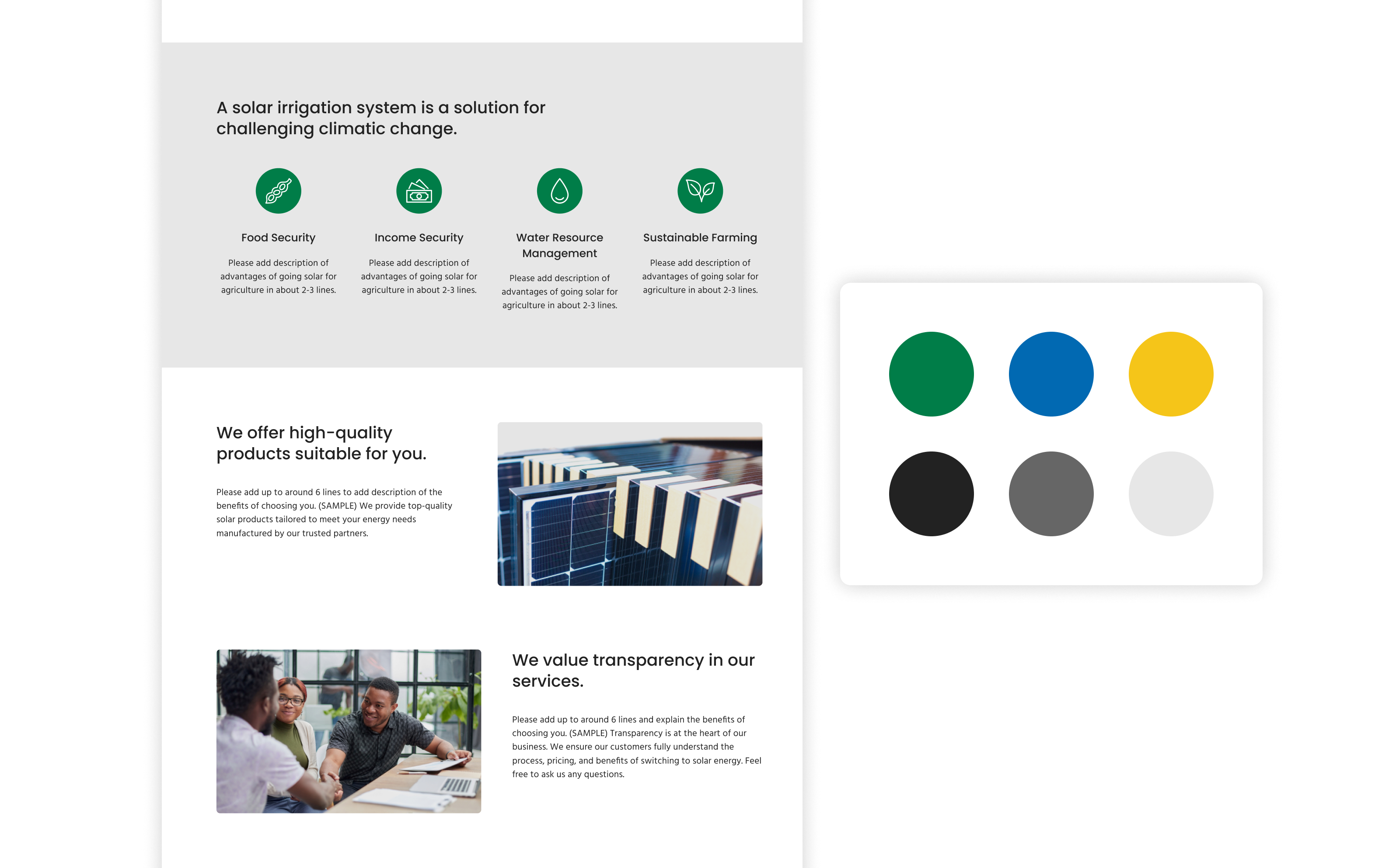
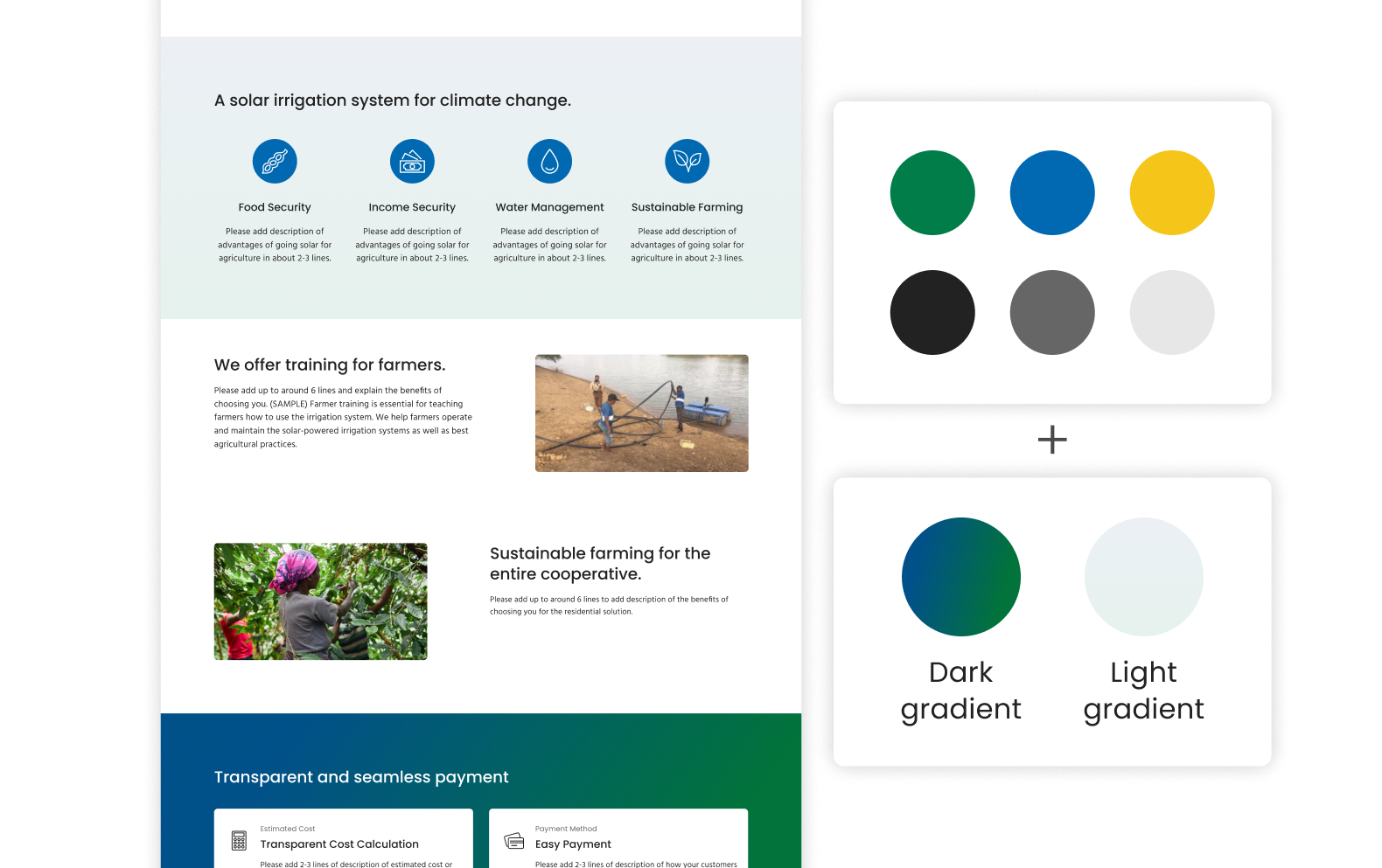
Our initial color palette felt too generic and lacked a technological feel, so we introduced 2 gradient palettes, one in dark blue-green and one in light blue-green, to make the visuals more distinctive.

Before - version 1
The page felt less engaging, especially due to the neutral background.
After - improvement
Gradient-accented backgrounds feel livelier and more technological.
Improvement 2
Visually highlighted the service process

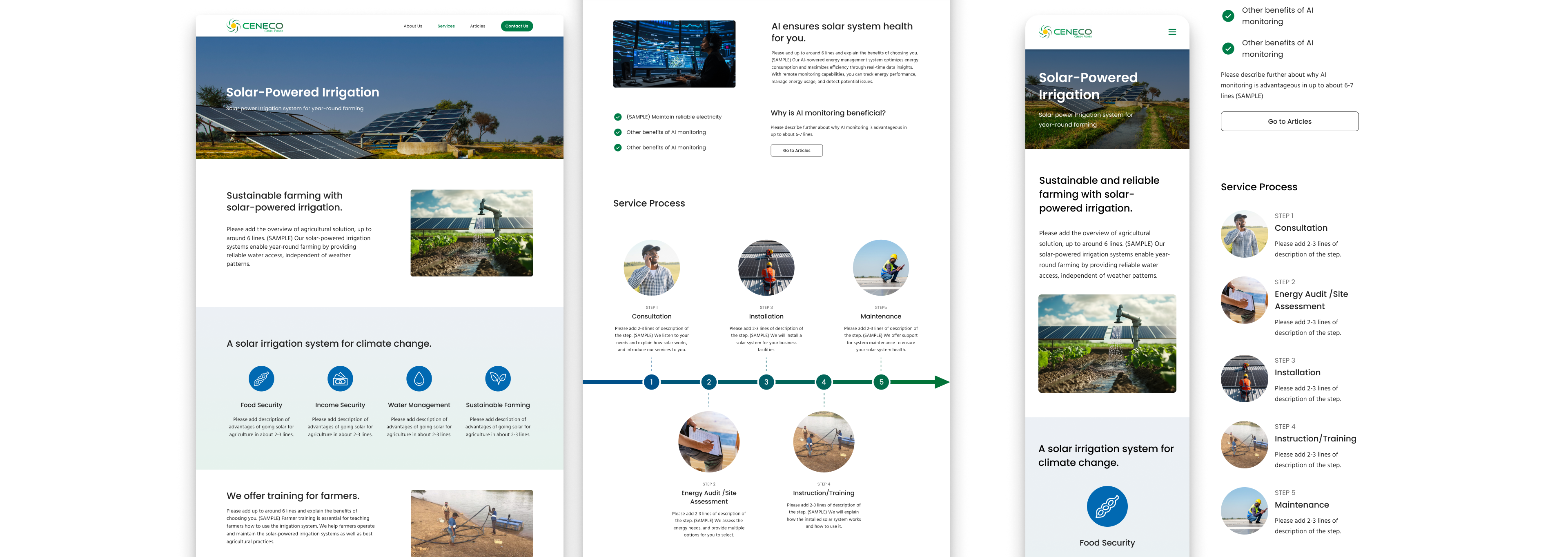
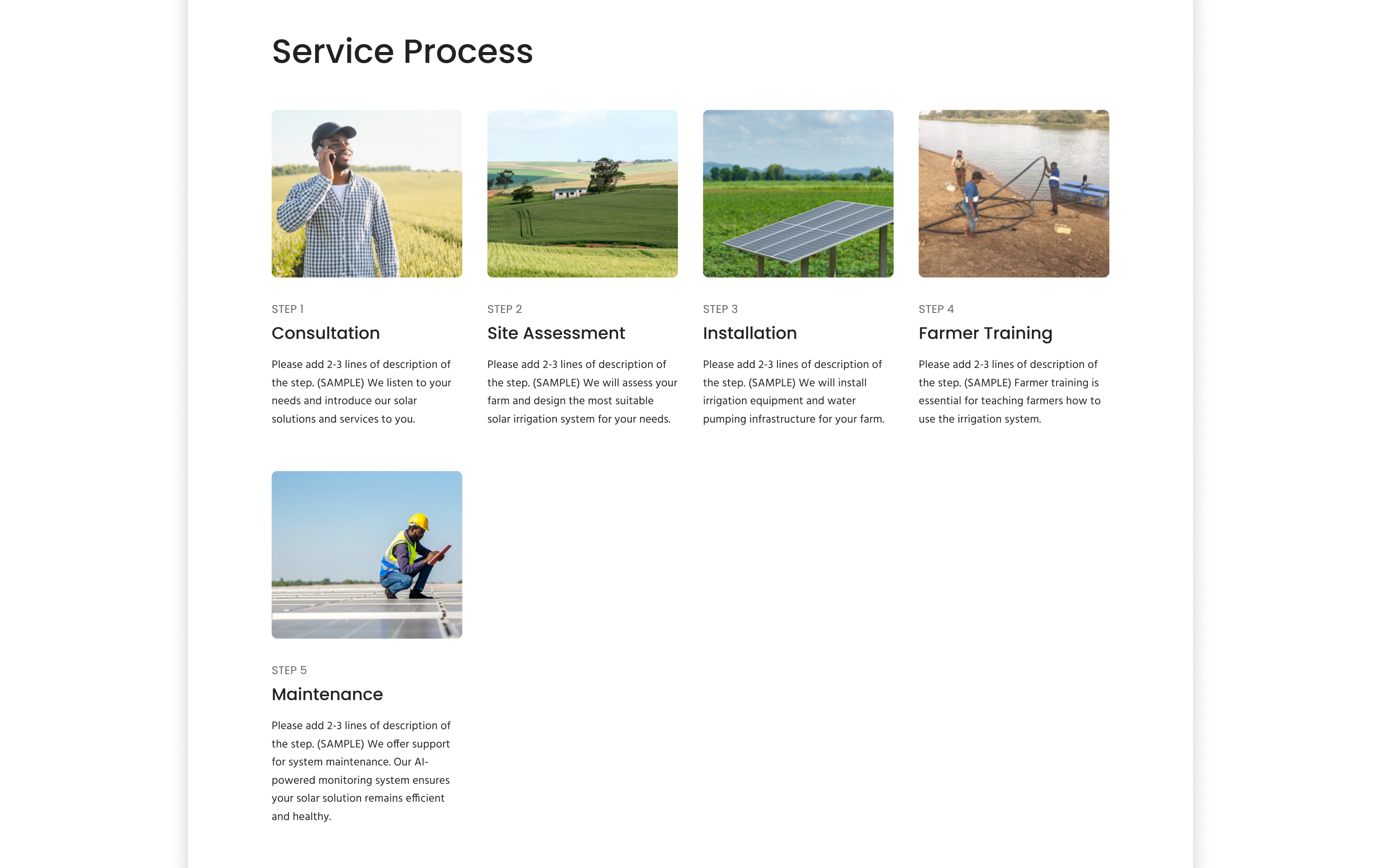
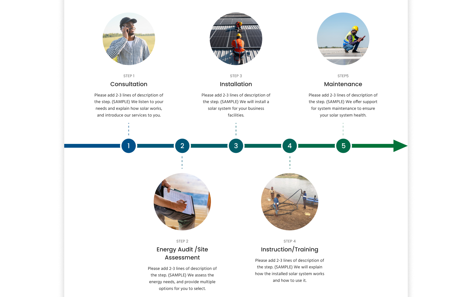
The service process section is important for understanding the offerings, but the initial design did not convey a clear sequence, which made it easy to overlook. I redesigned it to clearly communicate the flow.

Before - version 1
It’s easy to implement but doesn’t convey a clear sense of sequence.
After - improvement
Although technically more complex to implement, the arrow diagram effectively communicates the sequence.
Improvement 3
Added a project gallery to showcase real project images

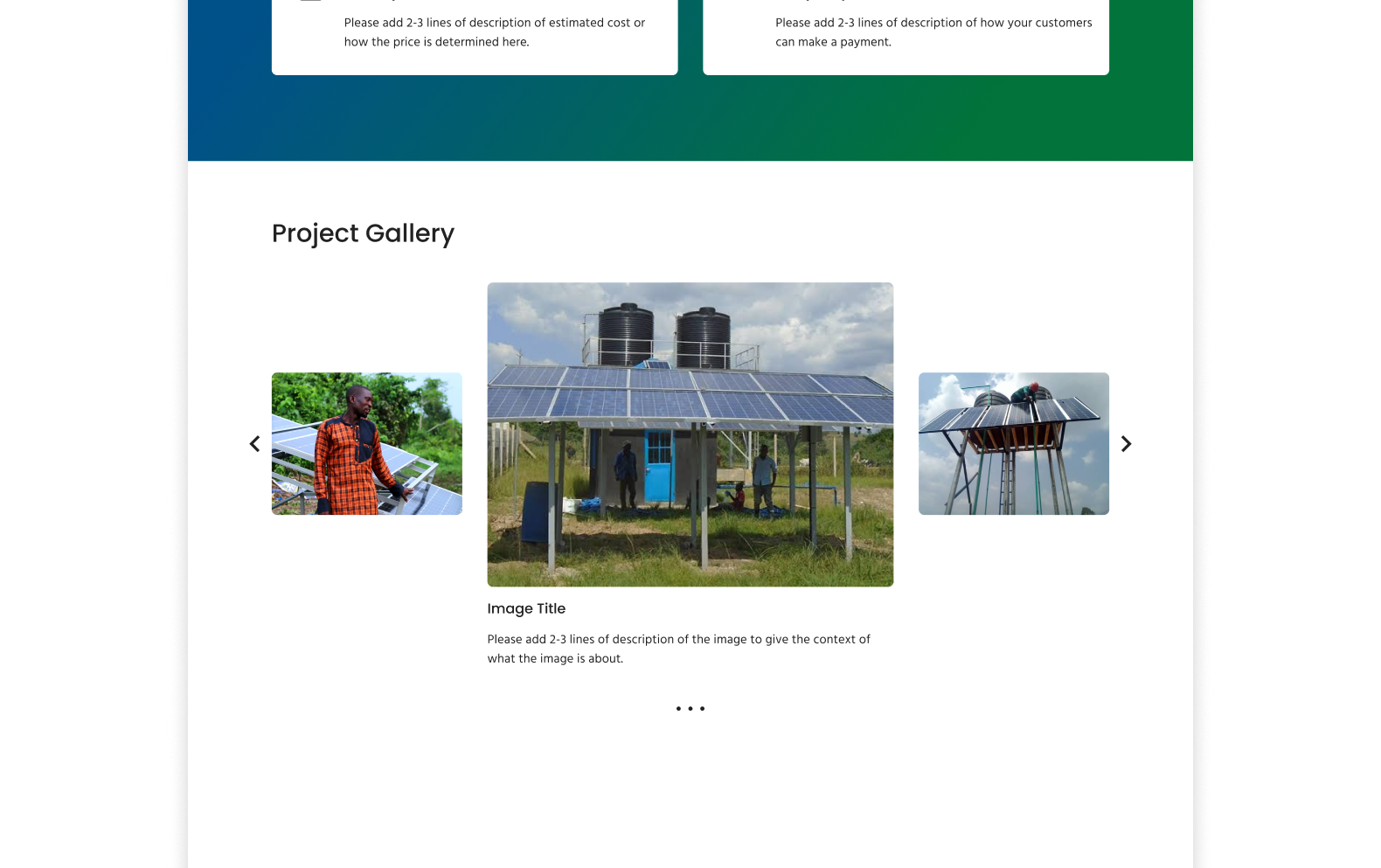
The stock images were visually appealing but we got the feedback that the design feel generic and lacked human touch and authenticity. To reflect the real identity, I added a project gallery using clients' real images.

Before - version 1
While stock images appear polished, using only them can make a site feel generic and lack authenticity.
After - improvement
Showcasing images from real projects help convey what the business is actually like.
Delivery - Design Documentation

Supported implementation and scalability with a design guide

As a former software developer, I recognized the importance of communicating design to non-designers. This led me to create design guides that included visual design guidelines, content guidelines (section purposes and tips for engagement), implementation resources, and an asset list.

Documentation Objectives
Easy & smooth implementation: Knowing the client needed to implement the Figma design in WordPress, I aimed to provide resources to make the process easier.
Consistency for new pages: Anticipating the future service expansion, I aimed to share guidance on designing additional pages while maintaining consistency.
Objective 1
Easy & smooth implementation
Objective 2
Consistency for future pages
Impacts

Our collaborative approach resulted in strong client satisfaction, buy-in, and implementation

With our design and collaborative approach, the client was satisfied with our work and adopted the design. After the project, they updated their website, which has positively impacted their business, including favorable feedback from customers. We are also confirming the quantitative impact, such as analytics data, with the client.

"I like how you keep it simple and sweet. What you have put out here is research driven and it’s a great job."
Sunday Olusheyi Falaye, CEO
"The current website is quite the opposite of old website in terms of quality and functionality."
Customer in Nigeria
The updated client website
Takeaways

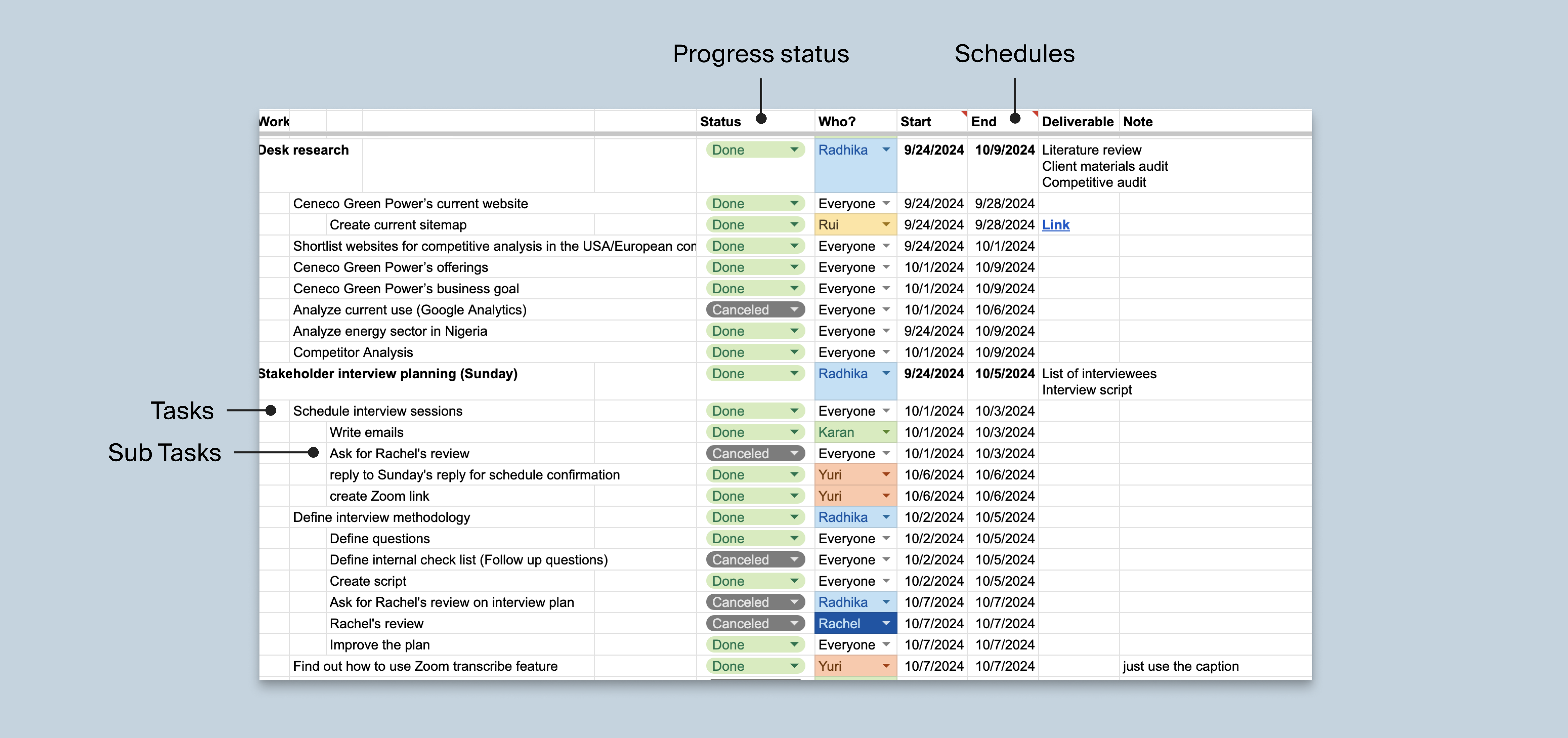
I learned the importance of adapting the design process within constraints

Regional barriers made this project challenging, with limited user access and client communication. We overcame this by using alternative research and design methods, which taught me to adapt strategically when the full design thinking process isn’t feasible.

I also learned the value of having a PM mindset, even as a designer. Since we began with an exploratory approach, we had to define the process, break down tasks, and set a schedule to stay on track. I contributed by organizing tasks in a shared spreadsheet, which helped the team stay aligned and reduced uncertainty.

Internal project planning sheet
Objective 1
Foster satisfaction for future buy-in
Achieve buy-in later by considering the client’s preferences, helping reduce the gap between expectations and the final design.
Objective 2
Set expectation for content volume
As the client is responsible for implementation and content creation, we aimed to define a feasible scope and ensure they were prepared.